This blog post details the presentation from Shaun Cole at the first Underpinnings Museum Twitter conference, entitled The Big Sell: Men’s Underwear Advertising in the Early 20th Century.
In addressing men’s underwear advertising, a number of problems are posed, associated particularly with the fact that its visual representation falls into the interstice between the fully clothed man and the male nude. Although printing techniques made the use of photography possible in newspapers and periodicals from the late 1880s, it was not until the late 1940s that photography began to take over from illustration as the favoured type of image in men’s underwear advertising. This presentation will give an overview of the content of a number of advertisements, looking at the presentation of the garments, their particular features, the bodies they were destined to be worn upon, and the particular means of attracting both male and female purchasers of men’s underwear.
Dr Shaun Cole is a writer, lecturer and curator, and Associate Dean Postgraduate Communities at London College of Fashion. He was formerly Head of Contemporary Programmes at the Victoria and Albert Museum, where he curated several exhibitions, most notably Graphic Responses to AIDS (1996), Dressing the Male (1999) and Black British Style (2004). Shaun has written and lectured extensively on the subject of menswear and gay fashion and underwear his publications include ‘Don We Now Our Gay Apparel’: Gay Men’s Dress in the Twentieth Century (2000), The Story of Men’s Underwear (2010) and Fashion Media: Past and Present (2013).
1 #UPMTC This presentation addresses the text and image in a number of ads from the 1880s to mid 1930s examining the features of men’s underwear construction, fabric, fit and the semi-clothed male body ‘wearing’ those garments. Images are from my personal collection
— Shaun Cole (@ShaunRCole) January 12, 2018
2 #UPMTC In earliest printed underwear ads discomfort with showing the real human body led to the use of classical statuary as a substitute. Oneita Knitting Mills’ 1898 ad features statues ‘wearing’ ribbed union suits that cover the ‘entire body like an additional skin’ pic.twitter.com/Ld26fda6Pn
— Shaun Cole (@ShaunRCole) January 12, 2018
3 #UPMTC The semi clothed body was also contextualised via sporting activity both through the location within the image and through the use of sporting poses and equipment. A 1915 advertisement for BVD features both fully dressed and underwear clad men in a locker room pic.twitter.com/VA04ucxQXy
— Shaun Cole (@ShaunRCole) January 12, 2018
4 #UPMTC Chalmers Knitting Company particularly highlighted sports with a series of ads released between 1910 and 1920 with men and boys undertaking various sporting activities such as boxing (as illustrated), shot-putting, pole-vaulting, weight training and diving pic.twitter.com/hJRwcUepAz
— Shaun Cole (@ShaunRCole) January 12, 2018
5 #UPMTC French writer Armand Lanoux declared the 1920s as the decade that ‘ushered in athletics, boxing and the stadium’. This athleticism was highlighted both through new lightweight cotton athletic union suits and language, as these in 1922 Rockinchair and 1932 Jaeger ads pic.twitter.com/0MEO1IyGEm
— Shaun Cole (@ShaunRCole) January 12, 2018
6 #UPMTC The body was also emphasised by some companies through its absence from the ad. Here the garments were shown laid out on beds or in dressing rooms or folded up in their sale packaging, as in this 1918 Coopers’ ad. The text emphasises ‘comfort plus durability’ pic.twitter.com/gfwGcuzOMz
— Shaun Cole (@ShaunRCole) January 12, 2018
7 #UPMTC A 1918 series of ads for Hanes ‘elastic knit’ underwear highlighted details as selling points. Dressed men cast large shadows in which details such as crotch and shoulder seams, elasticated wrist and ankle ribbing, and collar button fastenings were highlighted in circles pic.twitter.com/UcqutLxlpN
— Shaun Cole (@ShaunRCole) January 12, 2018
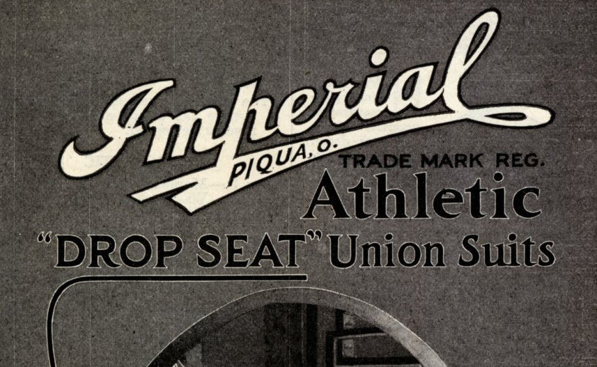
8 #UPMTC One feature that was particularly highlighted in union suits was the rear opening. Companies vied to produce the most easily useable and comfortable style and fastenings. Imperial, for example, had a ‘Drop Seat’ that was marketed as ‘comfort first’ in its 1917 ad pic.twitter.com/DjzabvvCTL
— Shaun Cole (@ShaunRCole) January 12, 2018
9 #UPMTC Images featured rear views of men were complicated and fashion historian Richard Martin stated had to be careful to avoid “capitulation to the anal anxieties in male depiction’. Hence the featured men were engaged in some justifying activity, such as opening a window
— Shaun Cole (@ShaunRCole) January 12, 2018
10 #UPMTC New developments in fabric were also highlighted, particularly those that kept wearer warm in winter or cool in summer. In Aertex’s 1927 ad nature is invoked through images of a man and woman and in mention of the fabric’s cellular construction and fresh air pic.twitter.com/EmO6gKHhtL
— Shaun Cole (@ShaunRCole) January 12, 2018
11 #UPMTC The presence of women within men’s underwear ads both reduced queer readings of the image and reinforced a heterosexual gaze. The (hetero)sexual tension is highlighted in this 1920s BVD advertising postcard. Also appealed to female buyer of men’s garments pic.twitter.com/hfWzCo760g
— Shaun Cole (@ShaunRCole) January 12, 2018
12 #UPMTC To conclude – the variety of imagery used in men’s underwear ads is varied but themes of the presentation of male body through sport imagery, the features and details that emphasised comfort and new patented developments in style and fabric were particularly evident
— Shaun Cole (@ShaunRCole) January 12, 2018
We will share each of the conference presentations via its own blog post over the coming weeks. If you’re on Twitter, you can join the discussion via the Underpinnings Museum’s account and the conference hashtag #UPMTC
The header image for this post features detail from an advert for Imperial athletic union suits, from Dr Cole’s personal collection.
